
Responses by Joe Stitzlein, type designer, Fontwerk.
Background: A labor of love over the course of 30 months of COVID-19 lockdowns, Hamster is the result of experimentation with cutting-edge font technologies, combining color fonts and weight variability. Aesthetically, we wanted something delightful and joyous that would warm the hearts of designers who used it. As we all emerge from COVID, we think the world will be hungry for color and joy.
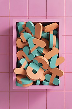
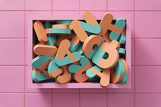
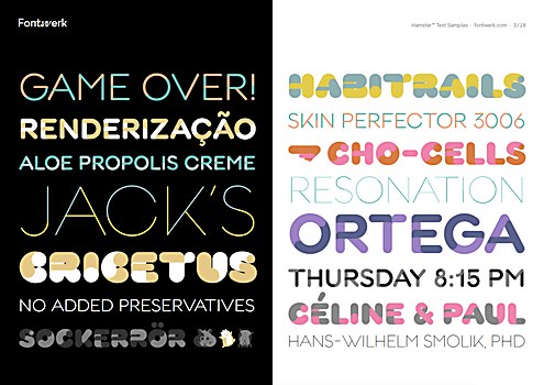
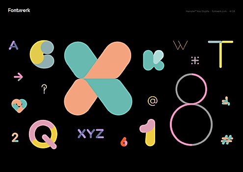
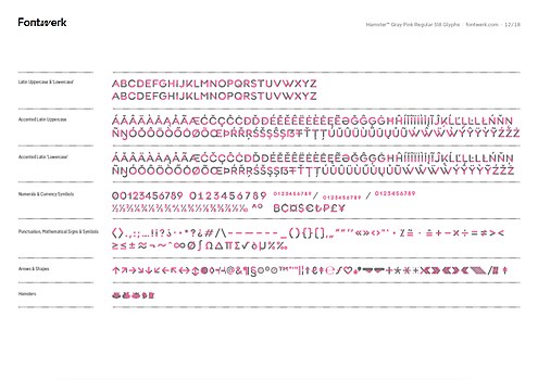
Design thinking: Hamster’s two-tone color layering has a cuddly, delightful simplicity inspired by the two-tone coats of hamsters. Its geometric modularity draws inspiration from the habitrail tubes that hamsters play in. Each letter has an entry and exit point as well, giving the forms like the capital T and X a fun energy and momentum. The weights change dramatically, from Esprit-like light weights to real bruisers in the bolder weights that almost close up their counters entirely. Many glyphs have surprises in their architecture, from the yin-yang 8 to the pinwheel-like asterisk and the collection of interlocking dingbat symbols. Hamster is a typographic playground for designers.
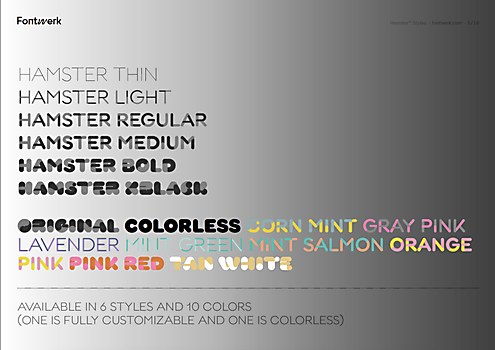
Challenges: Technically, ensuring that the two-color layers line up precisely was really difficult in every weight. Each color is a separate piece of vector art, but we wanted them to feel seamless together. We changed the design of some glyphs to avoid misalignments, which was tough when the weights extend from ultra thin to extra black. Each color glyph has six layers within it, which means that the font has 9,192 pieces of vector art!
At times, this was a design opportunity. The tail on the capital Q, for example, was impossible to fit in at the bolder weight. So, we embraced it getting thinner as the counter of the Q became bolder and bolder. The result is quite playful and whimsical, but it was actually driven by a need to solve a real design problem.
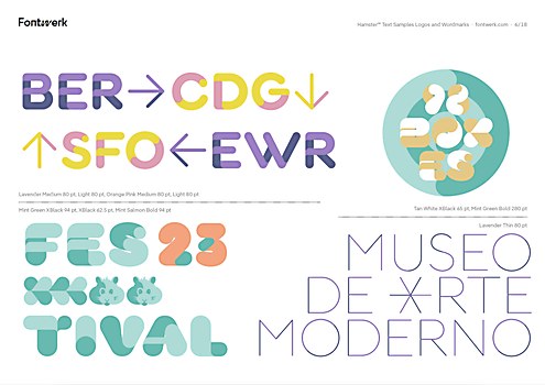
Favorite details: The little details and surprises here and there. The hamster icons and faces are hilarious. The geometric dingbats that interlock give the typeface a mod sophistication and can be used in wallpapers or patterns. We really sweated the details on each glyph’s craft; each one is really well drawn and looks great at a large scale.
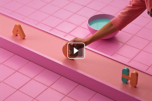
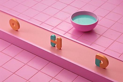
The color palettes themselves range from candy-like to more subdued. And each color layer can be fully customized to whatever web-safe color you want with a little bit of code. It’s really magical to see how the font changes color in browser!
New lessons: Everything! Hamster is a variable and a color font, and it has a lot of nifty tricks that took a lot of design work and engineering to get right.
To make a color font was Fontwerk’s suggestion, as we had never made one before. The alpha version used two different layers that you could color. This solution was not ideal; in fact, it was way too high maintenance. Luckily, the Glyphs app makes color fonts a little easier, so we combined the layers together into a font. The variability was a challenge and drove us to redesign some forms that went haywire when we tested them as they interpolated between the ultra thin and the extra black.
Visual influences: We were inspired by the geometry and modularity of the Bauhaus archetypes, especially those from Herbert Bayer and Jan Tschichold. These share a beautiful, circular architecture and fascinating glyphs. However, they are rather serious, and we wanted to use geometry in a way that made people smile when they use Hamster.
Browse Projects