


Responses by RETINAA.
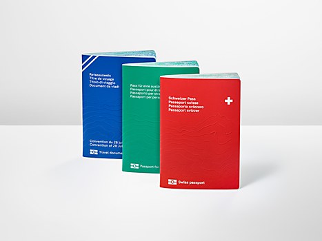
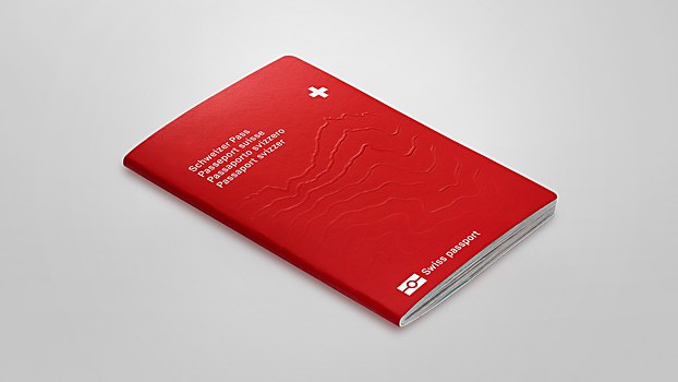
Background: Since 1959, the distinctive red Swiss passport is considered as one of the most sophisticated and secure travel documents in the world. Commissioned to design a new passport series by the Federal Office of Police (fedpol), we wanted to honor the tradition of innovation in Swiss graphic arts. In close collaboration with a group of experts led by fedpol, as well as contracting company Thales and printing company Orell Füssli, we developed a bold design that meets the high standards of Swiss security documents and aims to tell a story.
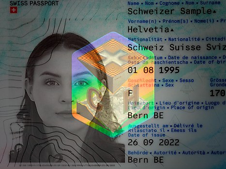
Design thinking: The Swiss passport is more than a formal administrative document. It’s the expression of Helvetic identity and culture and a brand ambassador for Switzerland abroad. It’s the celebration of Swissness and a showcase of our technological know-how. In addition to increasing security and being counterfeit-proof, we wanted the design to explore these aspects. Ultimately, for us, the project was about redefining what a formal administrative document looks like in the 21st century and creating a piece of design holders can trust, identify with and be proud of.
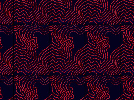
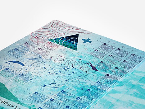
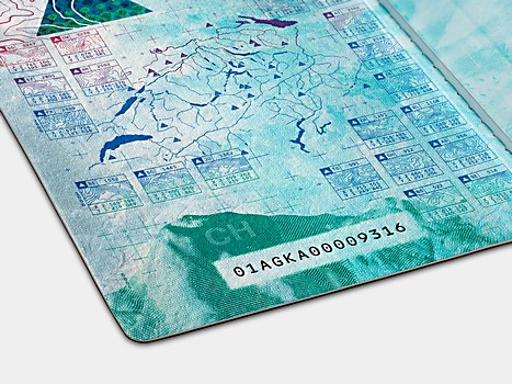
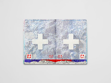
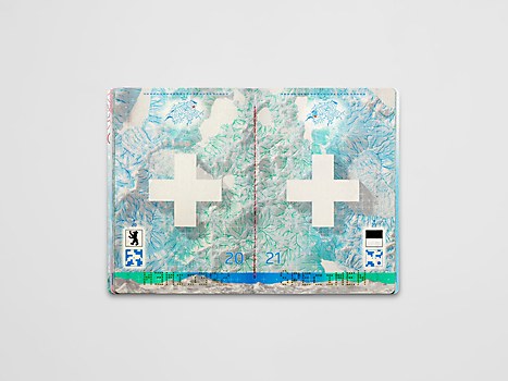
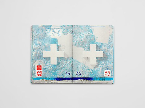
The starting point of our concept came from studying the Swiss territory itself. The country’s landscape is not only defined by its majestic mountains but also by the essential role water plays in shaping it. With its 1,500 lakes, thousands of glaciers, and countless rivers and streams, Switzerland is often referred to as the water tower of Europe. With 6 percent of Europe’s total drinking water volume, Switzerland also uses reserves to produce climate friendly energy, accounting for 56 percent of the country’s overall electricity production. On a symbolic level, water represents life and motion; its fluidity evokes interaction and exchange.
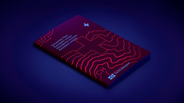
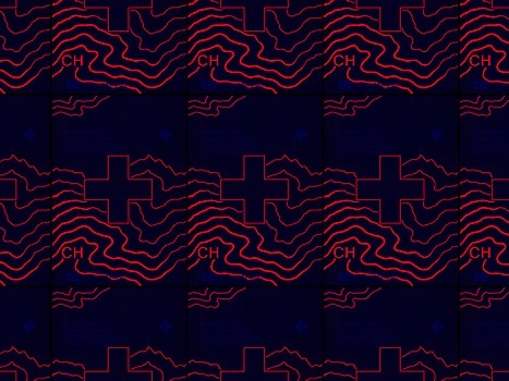
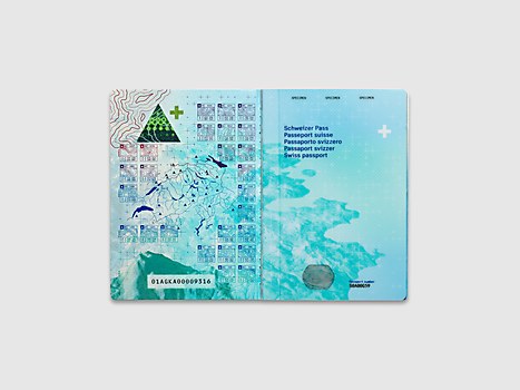
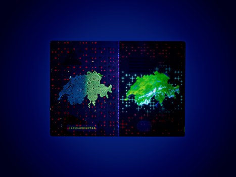
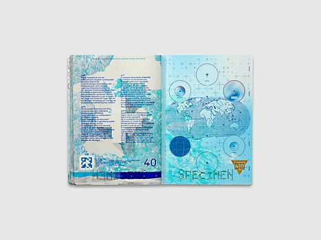
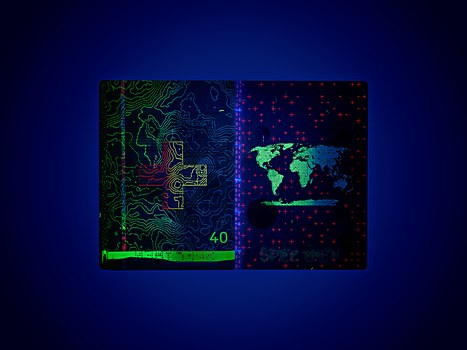
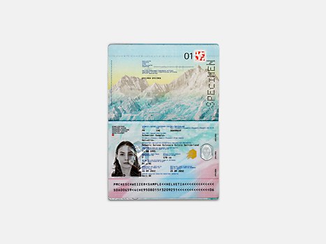
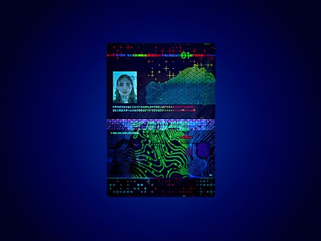
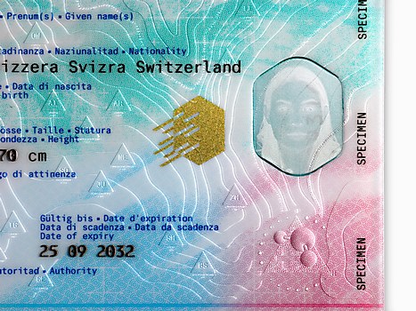
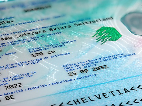
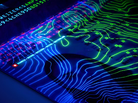
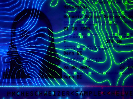
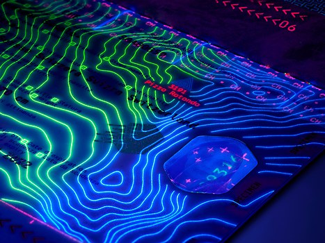
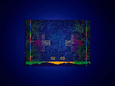
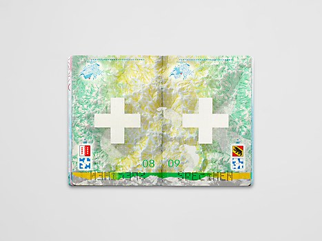
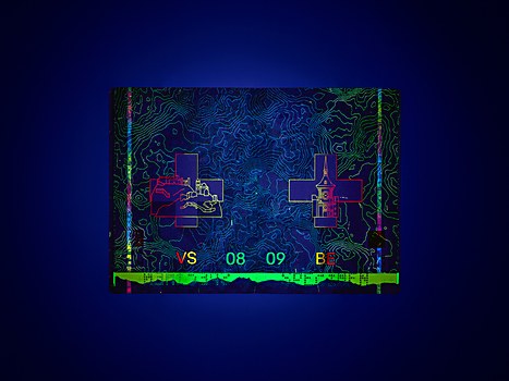
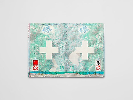
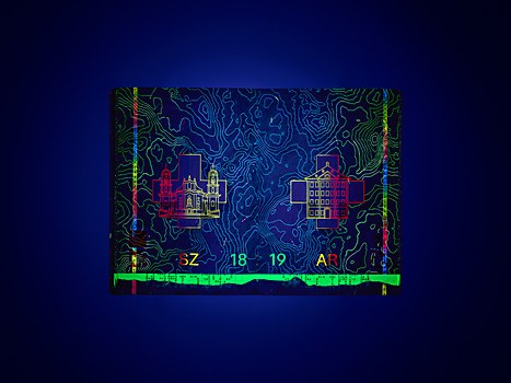
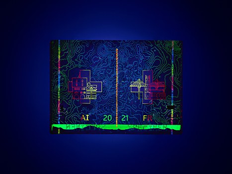
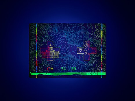
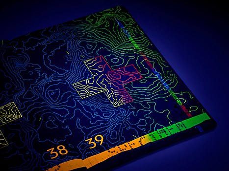
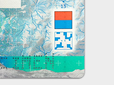
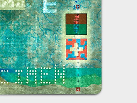
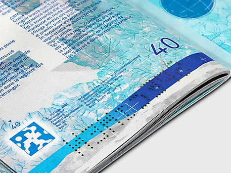
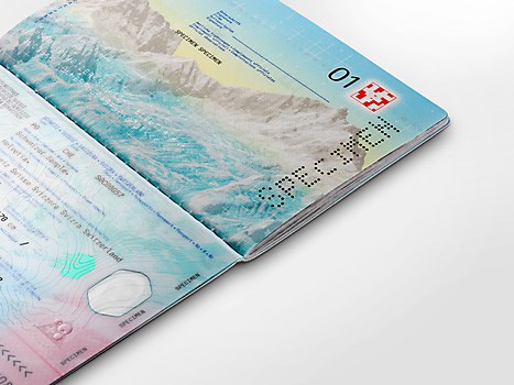
The passport depicts an imaginary journey along watercourses from alpine peaks down to the valleys, through Switzerland’s 26 cantons and to the world beyond. Drawing on cartographic tradition yet modern in its use of 3-D modeled landscapes, the design embodies the great natural landscapes of Switzerland. Under ultraviolet light, a network of isolines reveal the landscape’s topography enhanced with architectural landmarks, showcasing the country’s rich cultural heritage and history.
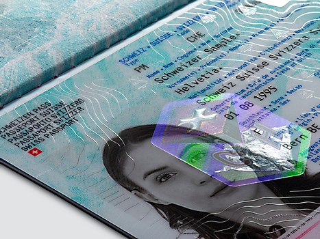
Challenges: Finding a perfect balance between security, functionality and aesthetics was a great challenge. It’s important to remember that passports are designed for humans but also for machines. Thus, this project required working with a large number of specifications and technical parameters and finding creative solutions within tight production constraints. On the new passport, we strove to weave security into a compelling visual narrative and design features that are not only hard to counterfeit and easy to authenticate but also play a role in the overall concept.
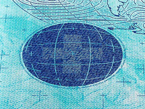
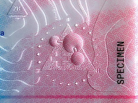
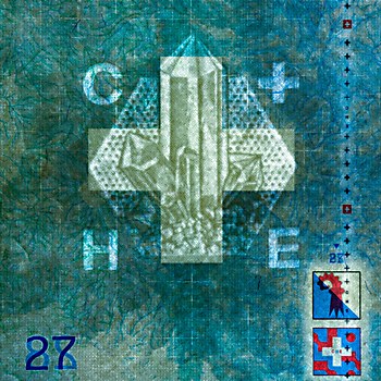
Favorite details: Despite its new design, the passport remains a multigenerational document. We felt it was essential to create visual connections with the 1985 and 2003 passports, which are still present in the collective memory of Swiss people. For the watermark’s design—visible when pages are held against the light—we created an image of a quartz crystal typical of the Alps, as a reference to the iconic 1985 passport designed by Fritz Gottschalk and Jenny Leibundgut that used a stylized quartz in the center of all visa pages. In the new passport, we concealed the crystal in the paper, just like the mineral hidden in its natural environment.
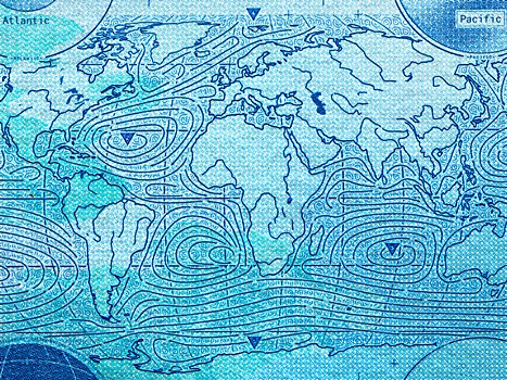
Visual influences: During the course of our research, we built a large iconographic library spanning Renaissance alpine engravings, 18th-century landscape paintings, mineralogy, scientific interfaces, maps and diagrams—all the way to Swiss Style and contemporary designs. We kept refining and expanding this library throughout the project, and it became a visual guide for integrating the concept and art direction, as well as quickly generating ideas and designing the features.
During our deep dive into Swiss topography, we became fascinated by cartographic history and the work of cartographer Eduard Imhof in particular. A professor of cartography at the Swiss Federal Institute of Technology from 1925 until 1965, Imhof was renowned for his “relief shading” work and created some incredibly beautiful school maps and atlases. His work was a great source of inspiration when we developed the color palette and color separation system for the passport.
Browse Projects