


Every detail and decision comes from a place. We’re all evolving our work based on something,” says Chad Michael, designer and owner of Chad Michael Studio, an award-winning branding studio based in Dallas, Texas. Questions of story and place are central to Michael’s work, which has included creating more than 100 brands and custom packaging for a myriad of beverages and specialty goods.

“I consider myself to be a designer of vices,” Michael laughs. “Spirits, tobacco, cannabis, playing cards…” The list goes on. And Michael’s dream project? “Psychedelic mushrooms. If psychedelic mushrooms ever become legal, I would love to package them in a luxurious way. It would be an incredible aesthetic and tactile experience.”
Browse Projects


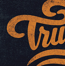
Although Michael first describes the sensory appeal of design, a single glance at his work makes it clear that his approach has less to do with making such “vices” look tempting and far more to do with extremely attentive storytelling. Every brand born or reborn through Michael’s studio is exquisitely crafted and steeped with details of the product’s story. From wood-engraved illustrations to tax seal motifs, custom type flourishes and intricate celestial diagrams, every component that Michael employs is carefully researched and considered. The result? Products that are a quintessential representation of themselves and the cultural histories within them.
“I can’t design a product without being able to tell a story about it,” Michael says. “I don’t enjoy or see value in designing based purely on aesthetics. I find most of my creative inspiration comes from looking at the past. That’s where the evolution begins, combining many different styles [and] stories and spinning them in a conceptual way to bring about some-thing inherently different. There’s a noticeable pattern of historic resurrection in my work.”
Michael’s path to design is a story of resurrection itself. As a child, his grandfather gave him a large box full of paper, which Michael remembers filling up with drawings. Years later, he attended the University of North Texas, where he struggled to decide on a major. Upon the suggestion of a counselor, he considered graphic design, and after a course in packaging design, Michael realized that he had found his passion.
At his midterm portfolio review, however, he failed to pass. But Michael refused to quit. He returned to repeat the year and renew his efforts. That time, his portfolio won “top senior portfolio.” He graduated with a graphic design degree and a minor in creative writing.
Michael immediately entered the New York branding agency world, working in design and creative direction roles. The agencies he served all happened to have some clients who made beverage products. Michael found himself gravitating toward those projects.
“Beverage packaging can be incredibly detailed,” he says. “I see each brand as a work of art. The possibilities are endless. Each brand’s story is unique and allows me to never repeat myself in my work. That’s one of the reasons why I fell in love with packaging design. It requires so much attention to detail, and I feed on details. [Packaging design] allows me the opportunity to work in so many different mediums at one time.”
In 2014, Michael founded his own studio. “I left the agency life because I didn’t get a lot of direct involvement with the clients,” he explains. “I love the personal relationships I have with my clients. They can reach [me] directly, and nothing is lost in translation. I work with a lot of small businesses, start-ups and mom-and-pop type companies. Often, it’s like we’re a family and building the brand together. I love that.”
With Michael’s bent for creative writing, words are essential to his creative process. When designing, he keeps a paragraph of words on a bulletin board behind his computer to remind him of the story that he wishes to convey.
“It’s all about discovering and pinpointing the story the brand wants to tell. If a new client comes to our studio with no brand story, then I develop one for them that will be distinct to their brand—a story shared by no other company,” Michael says. “I treat brands like people. What is their history? Where have they been? What is their character? I distill all this into a single paragraph, and everything builds from that foundation. If I can distill a brand down to one sentence, something like a slogan or tagline, the opportunity for the brand to succeed both visually and with the consumer grows exceptionally.”
Words are so key to Michael’s thinking that a single sentence uttered casually in conversation can inspire an entire creative direction. Michael both branded and named Hywilde (pronounced “high wild”), a coffee liqueur, based on a spark of resonance he felt in a few words his client used to describe the beverage. “Wildly impossible” became the slogan, and Michael’s visual direction began to tap into the reality-shifting realms of surrealist art. The final packaging designs for Hywilde feature dreamlike collages that juxtapose the credible with the incredible. The decisions of the color palettes and the mixture of objects are anything but random.
“There should be an answer for everything that you do [as a brand designer],” he says. “The client should be able to ask you, ‘Why did you make this decision?’ And you should be able to explain.”
Warbringer Southwest Bourbon is another product that Michael helped to name and brand. “The client came with essentially nothing,” he recalls. Through conversations, Michael identified that the client wanted a brand with a highly confident attitude, one that seemed ready to fight any competitor in the industry. Michael proposed the name Warbringer—as in, “war bringer.” Given the southwestern flavors of the product, Michael dove into the aesthetic of old saloons of the West. He scoured internet resources and examined objects of the era, including nonbeverage commodities like soaps and cigarettes. He noticed engraved animal motifs turning up again and again in brands.
“That’s how we landed on the ‘cock of the walk,’” Michael says, pointing to the center of the label, where a feisty rooster stands triumphantly atop another rooster. The label claims that the drink “will surely ruffle your feathers.”
Other clients come to Michael with a fully articulated story and seek his expertise in portraying the narrative through visuals. Birdie Brown, an unaged whiskey, was such a project.
Michael quickly retells the story: “Way back in the early 1900s, there was this woman named Birdie Brown who distilled hooch out of her cabin in Montana. She’s a legend for making a spirit that was actually safe to drink. She was known for her kindness and humbleness, and people came from all over to drink her hooch. She was this very warm, welcoming person.”
Michael began researching the details of Birdie Brown’s life, piecing together what her world may have looked like. Then, he selected a linen paper stock for the label and shaped the scalloped edging to mimic the shape of the apron that Birdie wore. When Michael learned that Birdie had a pet cat that people say they still sometimes see around today, he designed a slinky-looking cat as a graphic element within the brand. It appears in various touchpoints, not unlike a ghost. The lettering, custom designed by Michael for the brand, is a modern interpretation of embroidery needlework.
He struggles to articulate how he knows when he’s uncovered an appropriate visual identity for a product. “It’s a gut feeling,” Michael explains. “It’ll be like, ‘This feels exciting to me; this feels different.’ All the details align and pull the story together, like pulling the final thread on a [dress] seam.”
Given Michael’s obsession with details, this can be a complex balancing act. The Experimental Series from Tennessee Homemade Wines Co., a winner in Communication Arts’s 2022 Design competition, is one of Michael’s more typographically detailed projects. Each wine label features about ten different typefaces integrated on the same piece of paper.
“I don’t know how I know that this [particular typeface] will work with this [other one]. It’s a type marriage. It’s about finding marriages that speak to the personality of the brand you’re creating. It’s hard to express!” Michael says with a laugh. “A lot of it is innate [judgment]. Well, it is [intuitive] now, but it came with years of education and studying other type-driven works.”
While a noticeable number of products designed by Michael feature the aesthetics of bygone days, he does not consider himself to work in an old-fashioned style.
“I can see why [people] might say that because there are echoes,” he notes. “But my work is never a regurgitation. I strive to bring a fresh perspective, and I think that’s what people come to me for. People love nostalgia and revisiting something that’s been lost along the way. But again, the goal is not just to refresh an old aesthetic but completely evolve it. This is best done by figuring out how to seamlessly combine multiple styles, forms or solutions into one in order to birth something that no one has seen done quite that way before.”
Michael points to House of Forbidden Fruits, a brand of botanical perfumes, as an example that does not emphasize a particular era. The story instead is primarily suggested in the shape of the label and the illustration concept: a hand reaching into a door-like form, entwined with vines and a snake.
In a time where consumer goods are increasingly disposable (or at least recyclable), Michael aspires to create something more lasting. “To me, it’s all about the ritual, the experience, the indulgence of a product,” he says. “[My goal is] always to design something the consumer can’t bring themselves to throw away.”
Michael mentions that his house is full of antiques, but he doesn’t dislike modern or minimal designs—as long as they are smart. “Back in the day, there was high attention [paid] to craft that you don’t see now,” he says. “I think that got lost along the way with the invention of the computer.”
Yet, when asked what excites him most about the future of brand and packaging design, Michael points to something digital: non-fungible tokens (NFTs). “I can see packaging being much more valuable to consumers when NFTs become more understood by the majority,” he says. “Essentially, NFTs are digital assets that link to unique physical or digital items. These can be anything from one-of-a-kind works of art, music or real estate.
For example, if a consumer can take a photo of a product’s [packaging] and get [to own] something digital specific to that brand, this will make the consumer more invested in the brand and its growth. Hundreds of companies are already leveraging NFTs. I think it’ll take a while, maybe five or ten more years, but soon, everyone will be owning digital assets.”
Why does Michael think NFTs will become so prevalent as a long-term investment for both consumers and brands?
“NFTs are consistently shifting and evolving but the possibilities built within them are quite endless,” he says. “The interconnection between physical and digital goods will slowly become more integrated, and I’m looking forward to being a part of that evolution.” ca
Maya P. Lim (mayaplim.com) is a graphic designer, illustrator and writer based in San Francisco. Her work has appeared in Adobe Create, CreativePro, InDesign Magazine, HOW and PRINT, among other publications.