Responses by Jonny Black, founder and designer, The Office of Ordinary Things.
Background: A family-owned and -operated print shop in Boulder, Colorado, D&K Printing tasked us with creating a piece that showcases the scope, quality and ambition of its craft while also educating customers about sustainable printing basics. The company gave us free rein to design a print promo that exemplifies this in both form and content. The primary audience for the project was graphic designers, so we used the opportunity to create an educational guide on designing print pieces more sustainably.
Design thinking: The name Origins encapsulates the promo’s goals of transparency and insight into materials, methods and the print shop’s own history. Each spread contains detailed information not often explicitly mentioned in a final work: the inks, papers and production methods, as well as where they are made and how they arrive at D&K Printing’s facility. The hope is that it shows the inflection points and demonstrates the power designers have in changing paradigms around creativity and waste.
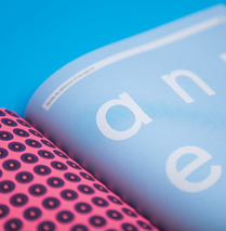
The unique immortality of print lies in its evocative interactivity and materiality. The promo comes alive in the ways it asks readers to participate and engage through sliding, tearing, flipping, ripping and unpacking. Zip strip letters spelling the client’s initials demonstrate the delight that can occur when we combine print with playful design.
Challenges: When a client gives you free reign to make something for them, it’s a challenge to figure out what you’re going to create while simultaneously avoiding placing the burden of content creation onto yourself. This shaped our approach to coming up with a concept, and as a result, the content creation became a collaborative effort with the client. The team at D&K Printing were instrumental in writing about their sustainability practices, documenting their own origin story and gathering the aforementioned supply-chain data for the materials used in the piece. We handled researching and writing about the sustainability merits of the materials, since that’s our area of expertise.
Favorite details: While the promo showcases classic eco materials like 100-percent post-consumer-waste paper and vegetable-based inks, we also chose to spotlight nascent materials like paper made from straw pulp and ink made with algae-based pigments. Not only are designers introduced to these as viable and attractive options, they’re also able to see how they feel and behave in real time while interacting with the piece.
Visual influences: When brainstorming, we honed in on the idea of using zip strips very early on. Tearing zip strips is like the sustainable equivalent of popping bubble wrap—ripping one is such a satisfying experience that can’t be replicated in any other medium. We went overboard and put eight total strips on the outer sleeve. When all eight are torn, the outer sleeve completely falls apart. It’s very satisfying, and the inherent ephemerality of the experience—since you can only tear it once—makes it all the more special.
Divergent paths: During the course of the project, we ran into many challenges. Most notably, the tear strips and zip strips didn’t rip as intended. They were made from a straw paper, an alternative fiber that behaved differently than conventional fibers. Because the problem wasn’t discovered until after the piece was printed, the goal was to salvage the pieces to avoid the waste inherent in reprinting. The D&K team employed a host of creative solutions, including a test where they glued a strip of paper on the inside of the sleeve to strengthen the tear strip. In the end, the solution that worked was a thin plastic adhesive tear strip. This option wasn’t ideal as it diverged from the project’s ethos, but using the strip outweighed the waste that would’ve otherwise occurred had the sleeve been reprinted. We learned that more tests are needed when working with papers made from alternative fibers. Though they sometimes behave differently than traditional papers, their environmental impact and unique visual and textural qualities can make them worth the extra effort.


